Quasar Typography
See how headings, blockquotes, definitions lists and more are displayed in the demo. At the end of this page you can read about CSS helper classes.
Default MD Font
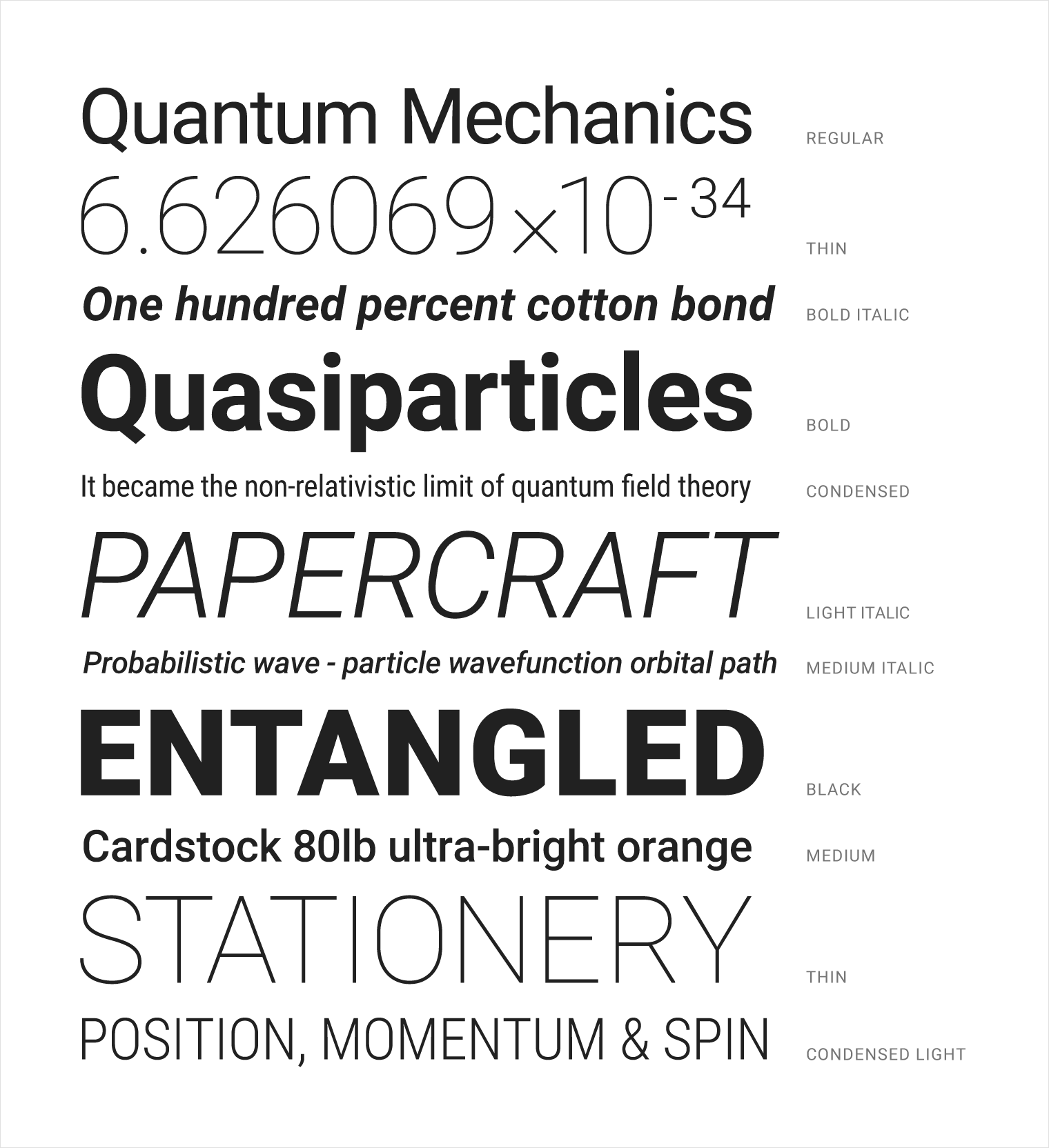
The default font embedded in Quasar App when built with Material Design Theme is Roboto. It comes with 5 different font weights you can use: 200, 300, 400, 500, 600. Below is an image from Google’s Roboto Specimen document displaying the different font weights:

NOTE
You can embed it for iOS theme too by copying font related code fromthemes/app.mat.styltothemes/app.ios.styland requiring the.stylversion of CSS insrc/App.vue
Text Types
You can display text in a variety of ways.
CSS Helper Classes
| Class Name | Description |
|---|---|
text-right | Align text to the right |
text-left | Align text to the left |
text-center | Align text to the center |
text-justify | Text will be justified |
text-truncate | Applies all CSS tweaks to truncate text when container is too small |
text-bold | Text will be in bold |
text-italic | Text will be in italic |
caption | For use on caption parapgraphs |
light-paragraph | Applies a font-weight of 300 |
thin-paragraph | Applies a font-weight of 200 |
uppercase | Transform text to uppercase |
lowercase | Transform text to lowercase |
capitalize | Capitalize first letter of the text |
strong | DOM element’s font becomes bold |
emphasize | DOM element’s font becomes italic |
round-borders | Every Quasar Theme has a generic border radius. This radius is applied to the DOM node |
block | display property set to block |
no-margin | Margins are set to 0 |
no-padding | Padding is set to 0 |
 Quasar